Posted by Gus | 0 Comments
Gabriel Orozco – Tate Modern
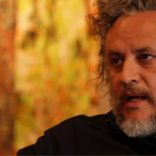
Someone just shared a link to this exhibition in the UK, and as I was watching the video below I remember I had seen his work before.
It turns out I saw it on Art21 via Netflix. It is quite interesting to see his point of view of many objects, streets and environments that he encounters, many of which we have encountered as well thorough out the years.
Perhaps this video or the link to Art21, can inspire you to think or view the world different from what you are accustomed. I know that personally I have appreciated the various artists presented in the PBS show.
If there is that one artist that has made an impact on your life and you don’t mind sharing, please add a comment and let me know. Thank you
Read MorePosted by Gus | 0 Comments
Local Color – Great Movie
Yesterday I had the opportunity to watch a great movie called “Local Color” – A very uplifting story of a younger person wanting to learn how to paint and an alcoholic painter who has giving up on art and life.
This movie was rented via Netflix, if you have the ability to watch it, I highly recommend it… this movie will definitely be an addition to our collection in the future.
“Don’t you let anyone ever talk you out of what you want to do, what you want to be” – Quote from the movie.
 teaches young John Talia (Trevor Morgan) how to paint.")
Posted by Gus | 0 Comments
Dreams – Crows directed by Akira Kurosawa
Just came across this video, the following caught my attention:
“A scene that looks like a painting does not make a painting, if you take time and look closely all of nature has its own beauty …”
Read MorePosted by Gus | 0 Comments
Dutch Light
A couple of weeks ago I noticed that Lou Romano made available the color script of Pixar’s UP movie in his blog.
It was interesting to look at the movie like this. Most of the time we are so caught up on the story that we seldom notice the variations of color, presented to us during the various stages of the story, after all we may go to the movies to unwind, be entertained, be distracted and even be informed as the case might be.
While having lunch with Dice Tsutsumi, and asking him about his role in Pixar, he mentioned that he was an Art Director and dealt with Light, like Lou Romano.
The color script and Dice’s conversation got me thinking about light, up until recently I was preoccupied only with getting it right when sketching, in terms of form, then realized I was striving to make it too perfect (I know, I know – its a sketch not a drawing). I read somewhere If you want it perfect, take a picture… in summary I have come to understand that a sketch is about capturing quickly the feeling of the view before oneself.
While reviewing the art from artists unknown to me as well as those that I admire, I came to realize that in an odd way I may have been on a path to the inclusion of light into my watercolors except that I thought it was a mistake. The watercolor below was one of my first, and strangely enough every time I share my small moleskine watercolor booklet with people they seem to stop at this one (while I explain that the water was never intended to be purple).

While I have been paying attention to everything around me a lot more since I started sketching (and also participating in SketchCrawl), I have now started to pay attention to the contrast of the various tones of light. It’s not that I didn’t pay attention before It is just that I had not conscientiously identified what I was looking at.
This brings me to Dutch Light, while researching lighting I came across a great DVD called Dutch Light. It is a film that investigates the existence of Dutch Light, did it ever exist? Does it exist now, or have environment changes affected the light. It was fascinating to watch.

If I recall correctly at one point in the DVD it is mentioned that artists would travel to Holland seeking the Dutch Light that some other artist may have painted… the comment being made was that an artist may seek a location used by another in order to achieve a specific feeling, not realizing that the first may have copied it from yet another artist and/or from somewhere else.
Enjoy!
Read MorePosted by Gus | 0 Comments
Sherlock Hound – Hayao Miyazaki – Kyosuke Mikuriya
wow look at this, youtube has full episodes of the Sherlock Hound animation.
I have yet to see this, it has been on my “to watch” list, it sure is nice to know they are available online.

There have 26 episodes from season 1
http://www.youtube.com/show?p=K162qI1LPF8
Enjoy!
Read MorePosted by Gus | 0 Comments
Veterans Memorial Hall
Yesterday my sketch attempt turned into a drawing 😉 and I didn’t mind it one bit, as a matter of fact time went by so fast. I spent about 30mins doing this drawing, the eraser was not used (didn’t have it with me) just tried to figure the angles and then darken the lines and add some more detail.

Materials: Strathmore sketchbook and Tombow Mono 100 HB
Read More